
- 2026-Jun-04
Espen Berg
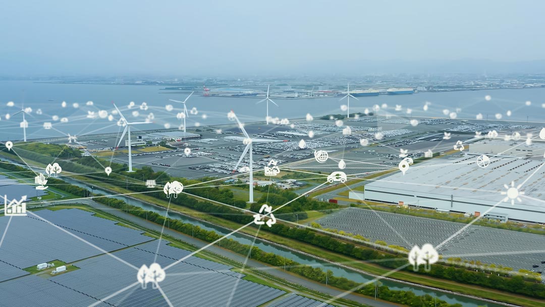
Our Intelligent Engineering solutions across products, plant and networks, combine our engineering expertise with advanced technologies to enable digital engineering & operations, develop autonomous products & platforms, and build sustainable energy and infrastructure
.png?width=774&height=812&name=Master%20final%201%20(1).png)
With the recent pandemic, the world has witnessed an extreme event that has disrupted normal life in many different ways. Supply chains have been no exception. The delay in responding to an unprecedented surge in demand for PPE (personal protective equipment) resulted in production lines across the globe being massively strained. Lack of preparedness cannot be attributed as the only reason behind such a strain, as no lead indicators foreshadowed the imminent increase in demand. Despite rapid responses and adjustments by governments worldwide, the PPE supply chain was under inevitable stress with widespread shortages, stockpiling, and logistics challenges reported. The Cyient team delved into the data to better understand the supply chain’s behavior using data science procedures. By formulating a stress index that could potentially define the buildup of supply chain fatigue, data scientists at Cyient developed a visual approach to understanding the effect on supply chains during unforeseen events.
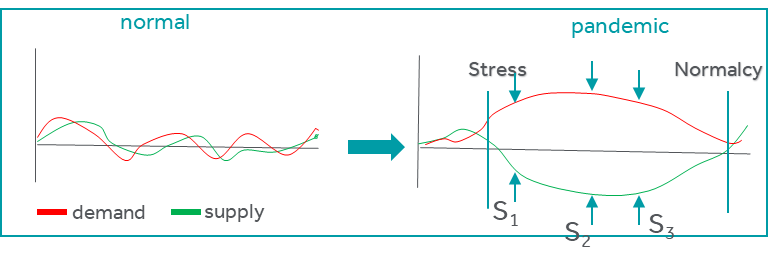
Visual approach to mapping supply chain stress
Cyient defined stress as the net deviation between the supply and demand curves with the delta between the two curves representing the stress. In normal conditions, this difference is marginal and manageable, and hence predictable. In pandemics or any unprecedented events, the delta diverges fairly rapidly, forcing managers to respond using their best judgment. Cyient observed that the difference could be classified into three distinct stages—initiation, peak, and relaxation. Stress increases when demand increases, while supply stagnates or decreases resulting in the three distinct stages of stress buildup in the system. The PPE situation has been no different. Cyient hypothesized that a normalized stress curve could be constructed to numerically define the extent of stress, its peak occurrence, and the possible return to more manageable levels. The intent is to prescribe possible relaxation measures to dampen supply chain stress via a data-driven index. Such proactive indices allow identifying product demand and risk and better ways of meeting peak demands on time.
Modeling PPE demand, supply, and stress curves
To model stress in the PPE supply chain, we have devised a framework that integrates multiple data sources and generates a demand curve, supply curve, and, finally, a stress curve. We have also included the Purchasing Manager Index (PMI) as an additional feature in the model to refine the stress curve.
The first and most important part of supply chain stress is the demand for PPE. PPE is a generic term that encompasses surgical masks, N95 masks, respirators, nitrile and sterile gloves, medical gowns, hazmat attire, aprons, goggles, and face shields. While it is possible to segregate each of these items into their own supply chain, we have consolidated them under the larger bucket of PPE. We relied on data provided by Our World in Data, JHU CSSEGIS, and the WHO in our analysis. Among these data sets, over 40 variables related to COVID-19 cases are represented, including total case count, new case count, total death count, total testing count, and country’s population. In particular, the WHO dataset provides information about total doctors and nurses, cleaners and lab technicians, and other healthcare worker details for over 200 countries. It also provides assumptions about the burn rate of different types of PPE for different healthcare providers who are actively working in COVID-19 hospitals and medical centers. We have stitched these disparate data sets into a master dataset enriched for missing and outlier values via data cleaning techniques. Further, we have derived additional features pertinent to the study by calculating the net active cases, mortality numbers, and recovery rates for each country. We have then estimated the daily PPE demand for active healthcare providers based on the WHO’s burn rate measure.
Care was taken to account for non-active healthcare workers to estimate PPE usage within this population segment. Formal and informal caregivers, laboratory staff at different medical and paramedical labs, technicians, and PPE usage by the general population were also included in our study to accurately measure the actual demand for PPE kits by category.
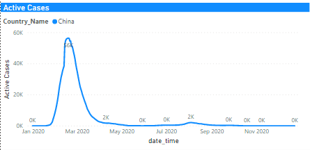
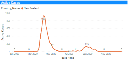
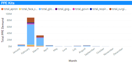
The demand curve for PPE has been built for each country based on active cases, lab technician count, net informal caregivers, and the general population’s overall size until the third week of September 2020. With this dataset, we were able to identify just the initiation zone in the stress curve. Notice in the two graphs in Figure 1 and the histogram in Figure 2 that a clear spike in demand is seen in March 2020 and April 2020 in two different geographies. To obtain the remaining two zones—the peak and the return to normalcy—we have used the Monte Carlo simulation to generate data for the subsequent three months from October to December 2020. We have considered the growth rate of daily cases, recovery rate, and daily death count, iterating over 1,000 simulations to generate synthetic data. We have rerun the analysis via this new data to calculate the expected count of active cases till mid-December. PPE burn rate has then been incorporated into the analysis to calculate the actual demand for PPEs based on healthcare workers, informal caregivers, and general population parameters. We also calculated the PPE demand prior to the pandemic to establish the baseline.
Figure 1: Forecasted active cases for China and New Zealand until mid-December
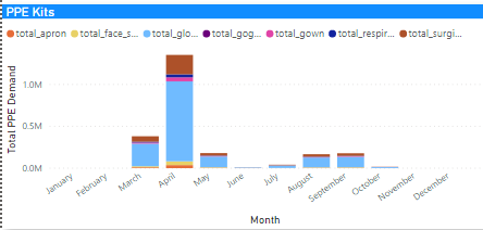
Figure 2: Expected total PPE requirements for active healthcare workers based on active cases
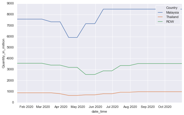
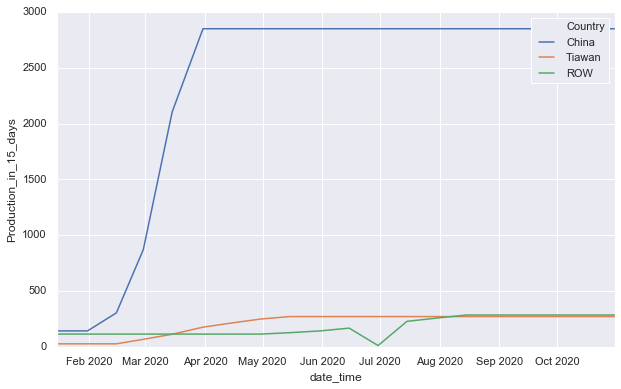
While the demand curve generation was comparatively easier to establish, to fully formulate the stress curve, we needed the supply curve to be generated. And this was a challenge given that the production of PPE has been primarily restricted to a few countries. While PPE manufacturing became more diversified post the pandemic, it was confined to a chosen few countries prior to the event. During the pandemic, many countries chose to manufacture PPE kits within their geography to meet their local demand. Thus, sourcing supply data was a painstaking exercise. However, we relied on the biggest makers of PPE per category to retrieve some useful data that could provide some indication of the supply-side behavior. We were creative in using this supply data and analyzed news articles and publicly available reports to understand the actual PPE manufacturing capacity and its increased production during the pandemic. For instance, China is the world leader in surgical mask and respirator production and manufactured half of the world’s surgical masks (10 million per day) before the pandemic. Its production surged 20X (200 million per day) in 45 days. Malaysia is the leader in nitrile and sterile gloves production and meets 63% of the global demand.
To further refine the supply data, we also considered policies and decisions enforced by the local government to prevent the spread of viruses such as lockdown conditions, import/export bans, which delayed production, shipment data, and export restrictions on PPE kits. We also considered pre-pandemic reports of PPE demand and supply information to establish the baseline. With a good understanding of the pre-pandemic production data, production changes during the pandemic, and current manufacturing policies related to PPE, careful extrapolation of PPE production until the end of the calendar year has been made. This estimate has then been used to calculate aggregated production data until December 2020.
Figure 3: Surgical mask, nitrile, and sterile glove production during 2020
We have also used the purchasing manager index or PMI as a sentiment score to support our findings on the true production capacity. The final quarter of 2019 was considered the baseline for manufacturing PMI, a value used to calculate the final PPE production capacity. The true production data has been estimated based on the PMI values and publicly disclosed manufacturing data. Our study indicates that PMI values match with the production rates reported every month until August 2020. To further strengthen the supply data, we have assigned individual weights to different PPE items based on their relative importance.
Global comparison of supply chain stress
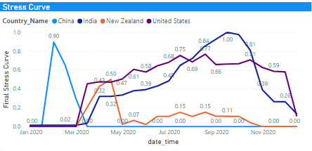
The stress curve that combines the demand and supply curves is shown in Figure 4 for four different geographies. Notice the three separate zones—initiation, peak, and relaxation—in each of the curves. Some countries have responded faster and better while others were lagging, but the stress was consistent across the world. The shape of the curve offers some insight into the effectiveness of each government’s response. However, it is heartwarming to note that the stress is diminishing on a global average, and the situation is expected to return to normal in the next couple of months.
Figure 4: Stress curves for China, India, New Zealand, and the US
In conclusion, Cyient’s data science team wanted to create a new and improved supply chain stress estimator for the broader community’s use. The simple index developed, which provides a numerical sense of induced fatigue, demonstrates this, and we hope it will be used for fine-tuning and further investigation.